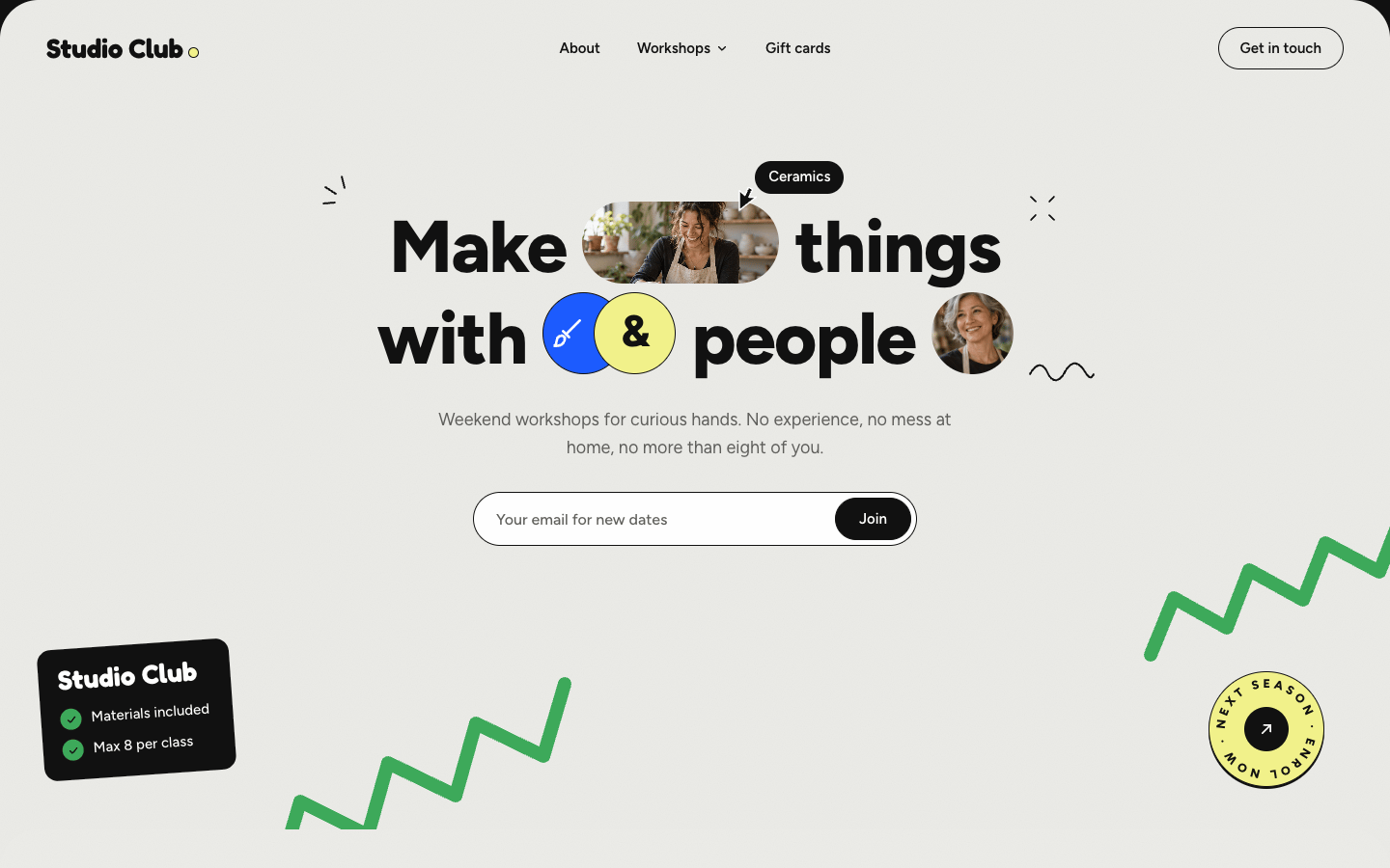
Studio Club page transitions
A Next.js kit where a curtain sweeps between pages and cards grow into their detail page.
Gallery
Prompt: Page transition kit (Next.js + Motion), Studio Club
Build a small Next.js 16 (App Router, TypeScript) site for Studio Club (weekend workshops in a shared creative studio), whose real purpose is to show off a reusable page transition kit: a curtain wipe between pages, a shared-element morph from a workshop card into its detail page (and back), and word-by-word heading reveals.
Follow the style guide style.md (Playful Collage), including its Page transitions section, exactly. Treat every token, signature pattern, motion rule, and item in its "Never" list as a hard constraint. Use only the photos below (in public/assets/); draw only what the style allows in code.
Assets (public/assets/)
| File | Size | Use |
|---|---|---|
topic-ceramics.png, topic-film.png, topic-drawing.png, topic-print.png, topic-weaving.png | 1536×1024 | Workshop card photos and detail heroes |
topic-plants.png | 762×508 (lower res) | Plant styling card + hero (keep the hero ≤ 760 px wide) |
trainer-portrait.png | 1024×1024 | Host avatar (circle, face at x 48%, y 35%) |
The full prompt is part of Pro.
You’re seeing the first 12 lines.
Tokens
Playful Collage v1.1paper#ECECE8
default section background, with grain
ink#111111
text, black cards, black buttons, doodles (15.9:1 on paper)
ink-soft#5E5E5A
body text (5.5:1 on paper)
card#FFFFFF
topic cards, inputs
leaf#3DAA5A
green section, ribbons, sticker fills. Ink text only on leaf (6.4:1; white fails)
lemon#F2F28A
yellow section, highlight marker behind a word, pill backgrounds (ink 16:1)
cobalt#1C5BFF
small round badges and the featured card. White text allowed (5.3:1)
Style: Playful Collage (v1.1)
Direction
A friendly, hands-on scrapbook for a real community: grainy paper, bold rounded type, photos tucked into pills and polaroids, hand-drawn doodles in the margins, and stickers that look freshly stuck on. It's cheerful but organised. Every section is a clean colored sheet that slides up over the previous one as you scroll, like a stack of cards.
Assets (mandatory)
Photos come from assets/ (people, rooms, still lifes). Never draw people, rooms, or objects in code. Code may draw: UI, the paper grain, hand-drawn doodle strokes (short curved lines, arcs, squiggles, and sparks: 2px ink strokes with round caps, no fills, never depicting objects), simple line icons, stickers, and the stamp.
Tokens
Color
| Token | Hex | Use |
|---|---|---|
| paper | #ECECE8 | default section background, with grain |
| ink | #111111 | text, black cards, black buttons, doodles (15.9:1 on paper) |
| ink-soft | #5E5E5A | body text (5.5:1 on paper) |
| card | #FFFFFF | topic cards, inputs |
| leaf | #3DAA5A | green section, ribbons, sticker fills. Ink text only on leaf (6.4:1; white fails) |
| lemon | #F2F28A | yellow section, highlight marker behind a word, pill backgrounds (ink 16:1) |
| cobalt | #1C5BFF | small round badges and the featured card. White text allowed (5.3:1) |
Rules: one colored section per screen; leaf, lemon, and cobalt never sit side by side as large fills. Ink is the only text color besides white-on-cobalt and white-on-ink.
Paper grain: an inline SVG feTurbulence noise (baseFrequency ~0.9, 1 octave) as a background image at 6 to 8% opacity over the section color. No other texture.
Type
- Headlines: "Figtree" 800, letter-spacing -0.02em, line-height 1.12. Hero 76px, section 48px, card titles 22px/700.
- Wordmark: "Fredoka" 700, 28px.
- Body: "Figtree" 400/500, 16px/1.6, ink-soft. Small labels 13px/500.
Shape
- Sections: 40px top radius, full width, stacked (see Motion).
- Cards: white, 1.5px ink border, 28px radius, 14px inner padding, photo with 18px radius.
- Pills: 999px radius. Buttons: ink fill, white 15px/600 text, 44px tall; outline variant 1.5px ink.
- Black info card: ink background, white text, 14px radius, with leaf check icons.
Signature patterns
- Photo-pill headline: a centered two-line headline where 2 to 3 photos sit inline as pills (capsule 2.4:1, or circle) the same height as the cap height ×1.6, plus one round icon badge pair (cobalt circle + lemon circle overlapping, the lemon one holding "&").
- Marker highlight: one word in a section title sits on a hand-torn lemon (or white on lemon sections) marker shape, slightly rotated -2°.
- Cursor sticker: a black arrow cursor with a black pill label ("Ceramics") that floats near the hero, as if a collaborator is pointing. Its arrow tip always touches the element it names (on every breakpoint), never floating in empty space.
- Ribbon zigzags: two thick leaf zigzag strokes (14px, round joins) breaking out of the hero edges.
- Rotating stamp: a 120px circular text badge ("ENROL · NEXT SEASON · ENROL ·") with an arrow in the middle, slowly rotating.
- Polaroid stack: 2 to 3 photos as tilted cards (±6°) with a small cobalt or leaf caption tag, overlapping.
- Bubble menu: white circles of different sizes with short labels, floating on a leaf section, one black "Learn more" bubble.
- Topic grid: white cards: photo, small meta ("12 sessions"), title, and a small outline button with a playful googly-eyes icon.
Motion
- Stacked sections: each section is
position: sticky; top: 0(or top offset 24px) so the next section, with its 40px top radius, slides up over it while the previous one scales to 0.96 and darkens 8%. Sheets taller than the viewport stick attop: calc(100vh - <sheet height>)so their bottom is readable before the next sheet covers them. The first sheet has square top corners (the page starts flush), and the page behind the sheets is ink. - Hero entrance: headline words and photo pills pop in with a 70ms stagger (scale 0.6 → 1, rotate ±6° → 0, spring-like
cubic-bezier(0.34, 1.56, 0.64, 1), 600ms). Doodles draw in withstroke-dashoffset(500ms). Ribbons draw in from their ends (800ms). - Idle life: the cursor sticker drifts on a small loop (12px, 6s); the stamp rotates 360° every 18s; bubbles bob ±6px at different phases; polaroids tilt 1° toward the pointer on hover.
- Card hover: lift 4px and rotate -1°, googly eyes look toward the pointer.
- Reveal observers use
threshold: 0with no negative bottom rootMargin; anything in the viewport on load reveals immediately. - Reduced motion: no stacking scale, no pops, no idle loops; everything static and visible.
Copy voice
Warm, direct, a bit cheeky. Short sentences. Talks to "you".
Never
- Gradients, glassmorphism, drop shadows heavier than
0 2px 0 inksticker shadows - White text on leaf or lemon; more than one big color fill per screen
- Inter, Roboto, Arial, or system fonts as the visible font
- Emoji in place of icons or doodles
- Doodles that depict objects (no drawn plants, people, or tools); strokes and sparks only
- Stock-photo clichés (handshakes, people pointing at laptops)
- Phrases like "unlock your potential", "level up", "world-class"
Page transitions (multi-page apps)
For Next.js App Router sites in this style. The pattern is cover → navigate → reveal, coordinated by one client TransitionProvider that intercepts internal link clicks, so it works without freezing the router and with the browser's back/forward buttons.
- Library:
motion(Framer Motion) for every animation; no CSS transitions for page changes. - Curtain wipe (between top-level pages): an ink panel with a 28px lemon leading edge and a hand-drawn wavy edge (SVG path) sweeps up from the bottom to cover the screen (480 ms,
cubic-bezier(0.76, 0, 0.24, 1)), the route changes underneath (router.push, then wait for the new pathname to commit), and the panel continues upward off the top (480 ms, same easing). The page wordmark sits centered on the panel while it covers. - Shared-element morph (card → detail): on click, measure the card photo's rect; render a fixed-position clone (same image, same radius) at that rect in the provider; navigate; the detail page registers its hero photo element; the clone animates to the hero's rect and radius with a spring (
stiffness 170, damping 24), then hands off (hero becomes visible, clone unmounts in the same frame). The card's title morphs the same way into the detail headline. Everything else on the detail page waits and enters after the morph. - Reverse morph: going back from a detail page animates the hero photo back into its card's rect (cards register their rects by slug on mount), with the grid already rendered underneath.
- Text entrance on every page: headings split into words that rise from a mask (
y: 110% → 0, 520 ms,cubic-bezier(0.22, 1, 0.36, 1), 45 ms stagger); body copy fades up 12 px after the heading; stickers and doodles pop in with the style's spring. - Scroll: restore the scroll position when going back (the grid returns to where the card was); new pages start at the top before their reveal.
- Interruptions: a click during a running transition is ignored; navigation by back/forward during a transition finishes the current one instantly first.
- Reduced motion: no curtain and no morph, just a 150 ms cross-fade of the page content, with headings visible immediately.
- Performance: animate transform and opacity only (the morph uses transforms on the fixed clone, never width/height/top/left); preload the detail image on card hover/focus; the curtain stays above everything (
z-indextop) and ispointer-events: noneexcept while covering.
 cta-group.png594 KB
 pill-ceramics.png1.5 MB
 room-session.png1.3 MB
 room-studio.png1.2 MB
 topic-ceramics.png1.6 MB
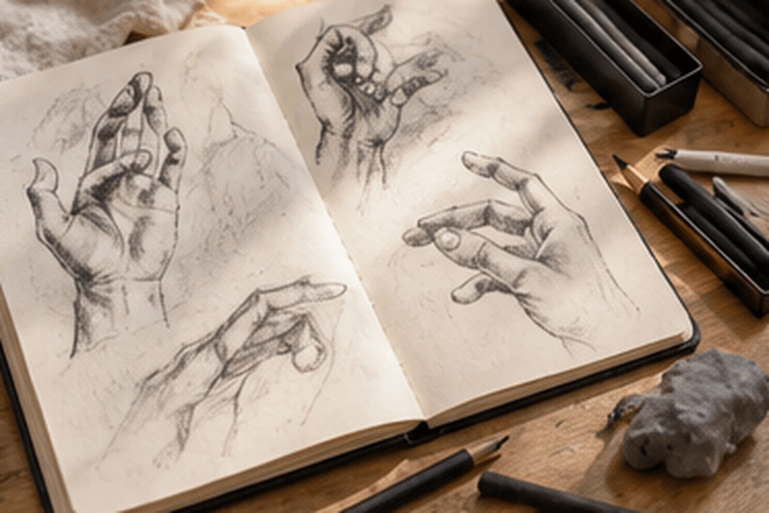 topic-drawing.png1.5 MB
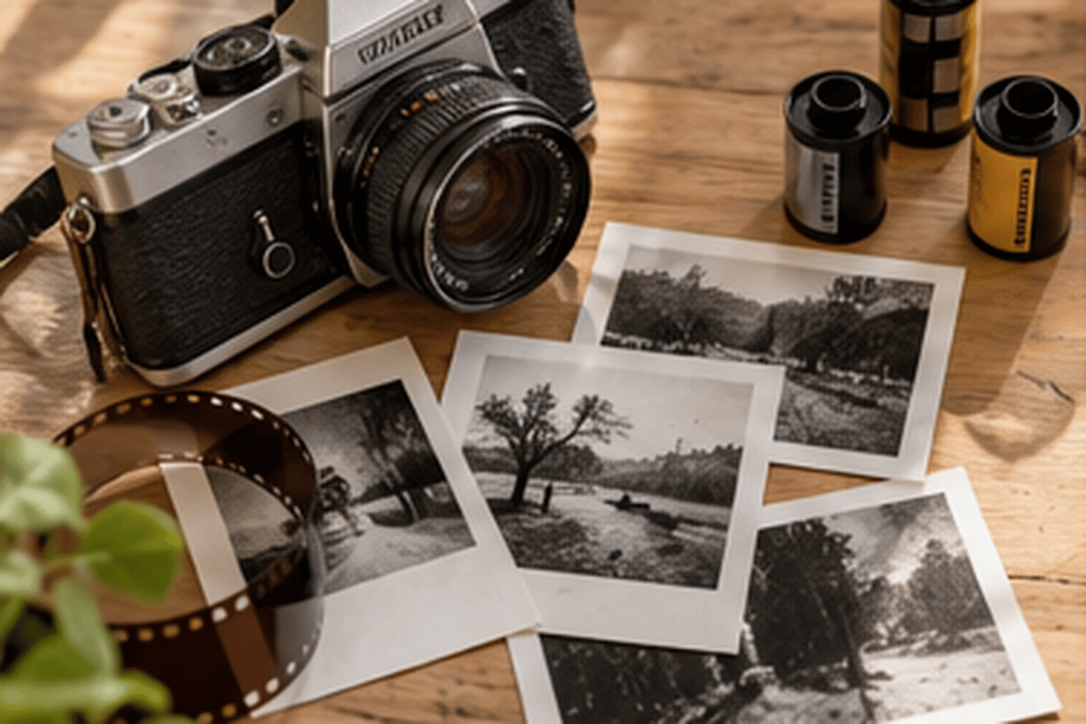 topic-film.png1.7 MB
 topic-plants.png746 KB
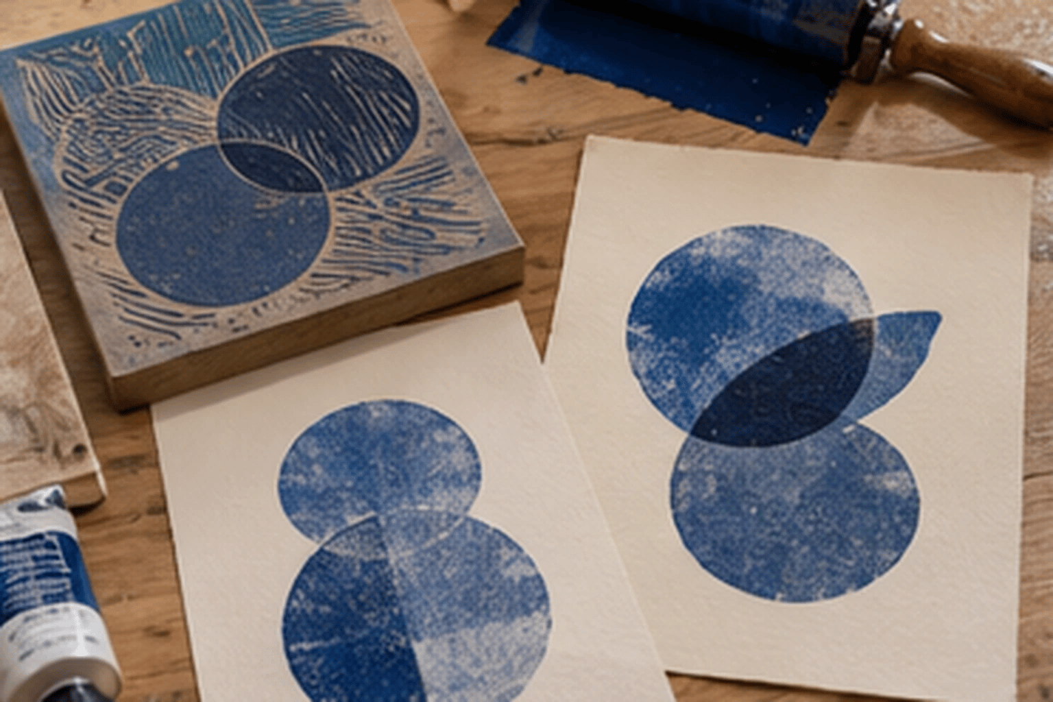 topic-print.png1.7 MB
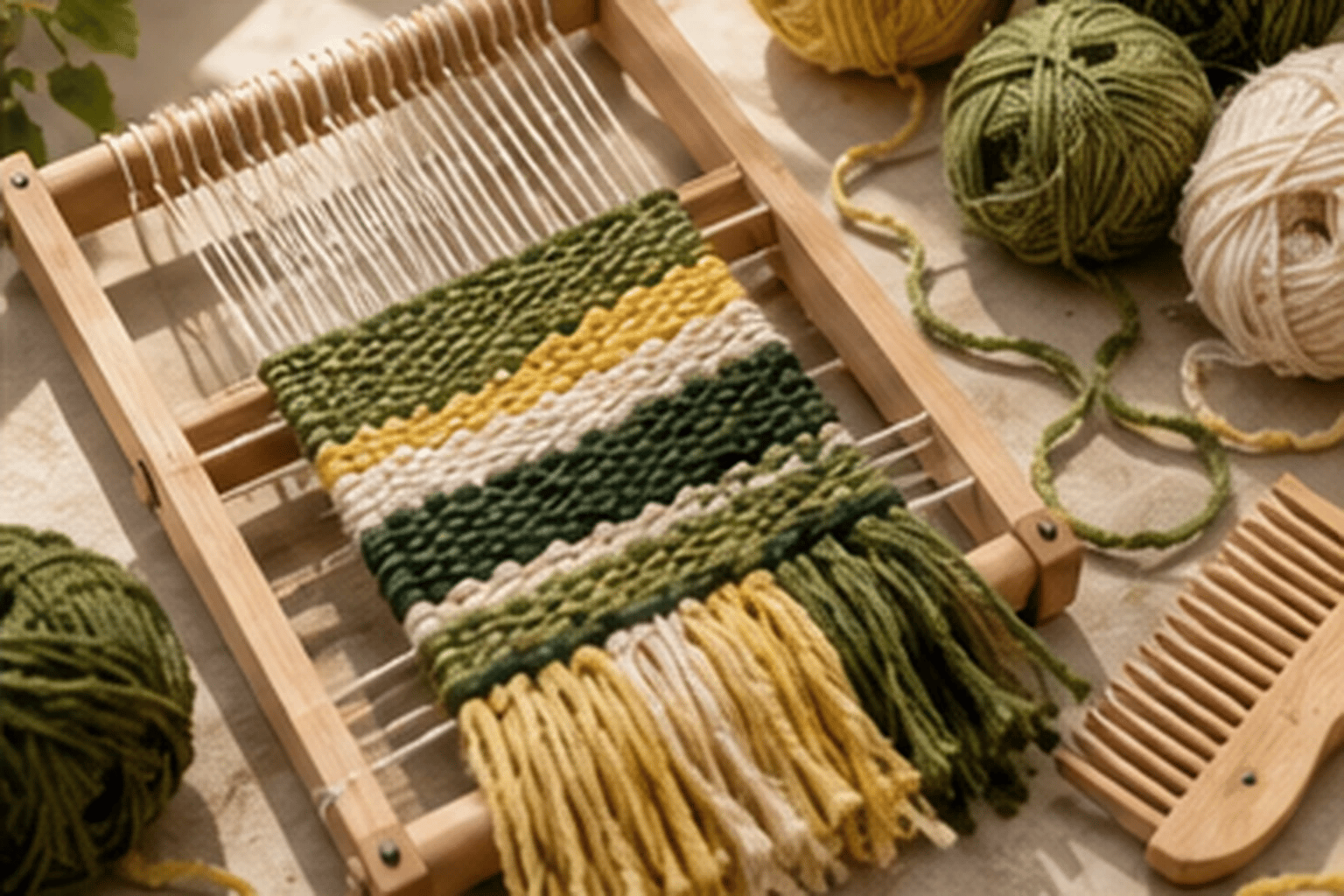 topic-weaving.png2.1 MB
 trainer-portrait.png975 KB