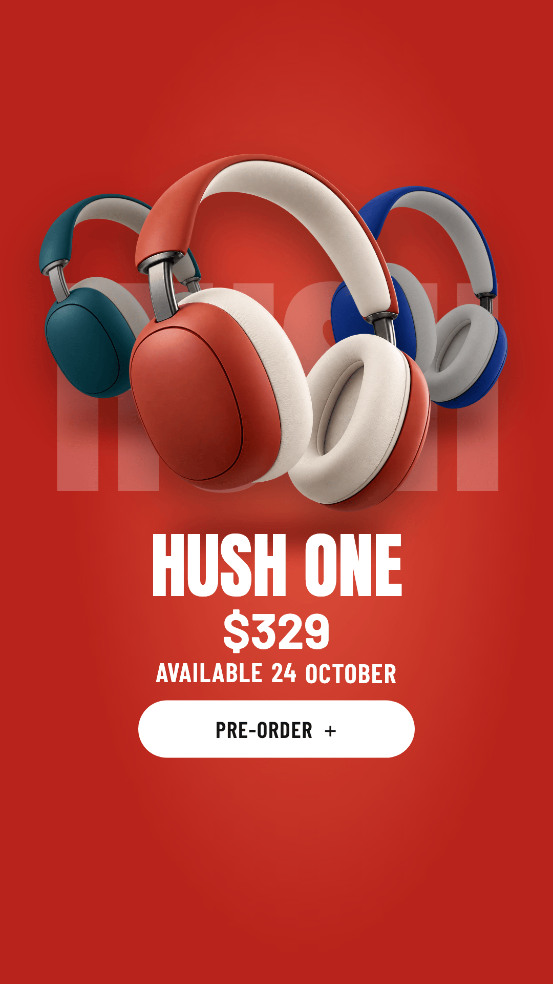
Hush One product hero
One pair of headphones in three colors. Pick a color and the whole stage repaints while the product slides in.
Gallery
Prompt: Product hero with colorway switcher (web), Hush One
Build a full-viewport product showcase hero for Hush One, over-ear wireless headphones by the fictional audio brand Hush. Three colorways (Ember, Cobalt, Lagoon), each with its own stage color. The hero should feel like a premium product drop: the headphones fly in, float in front of a giant wordmark, and switching colorways repaints the whole stage with a choreographed slide.
Follow the style guide style.md (Chroma Showcase v1) exactly. Treat every token, layout rule, motion rule, and item in its "Never" list as a hard constraint. Use only the product images below; never draw the product in code.
Assets
| File | Size | What it shows |
|---|---|---|
assets/hush-ember.png | 1024×1024, transparent | Headphones, red-orange, floating at ~20° tilt |
assets/hush-cobalt.png | 1024×1024, transparent | Same pose, royal blue |
assets/hush-lagoon.png | 1024×1024, transparent | Same pose, deep teal |
The full prompt is part of Pro.
You’re seeing the first 12 lines.
Tokens
Chroma Showcase v1.1ember#B8231B
Base + glow #E2553F
cobalt#1B3BD1
Base + glow #5372F2
lagoon#0E6664
Base + glow #2A948E
on-stage#FFFFFF
wordmark, price, headings, nav, labels, body
button-ink#141414
text on the white pill button
Style: Chroma Showcase (v1.1)
Direction
A single product on a saturated full-bleed stage, in front of a giant word. The stage color is the product variant, so switching the colorway changes the whole room. The product is a crisp photographic cutout floating in front of a massive condensed wordmark, and the UI around it is small, white, and sporty, like a sneaker drop page. Motion is the point: the product flies in, floats, and swaps with a choreographed slide while the stage color morphs.
Assets (mandatory)
Product images come from assets/ as transparent PNG cutouts, one per variant, all in the identical pose, angle, scale, and lighting so a swap reads as the same object changing color. Never draw the product in code. Code draws only UI, the stage, the wordmark, and shadows.
Tokens
Stage colors (per variant). Each variant defines base (edges, where text sits) and glow (center light):
| Variant | base | glow | white on base |
|---|---|---|---|
| ember | #B8231B | #E2553F | 6.4:1 |
| cobalt | #1B3BD1 | #5372F2 | 8.1:1 |
| lagoon | #0E6664 | #2A948E | 6.8:1 |
- Stage background:
radial-gradient(ellipse 60% 70% at 55% 48%, glow 0%, base 70%). This radial glow is the only gradient in the style. - The page outside the stage (when the stage is shown as a framed card on large screens) is the base color mixed 55% with white.
- New variants must keep white on base ≥ 4.5:1 and white on glow ≥ 3:1.
Ink on stage
| Token | Value | Use |
|---|---|---|
| on-stage | #FFFFFF | wordmark, price, headings, nav, labels, body |
| on-stage-soft | rgba(255,255,255,.85) | body copy, secondary labels (≥ 4.5:1 on every base) |
| on-stage-line | rgba(255,255,255,.55) | outlines of option chips, arrow buttons, swatch rings |
| button-ink | #141414 | text on the white pill button |
Type
- Wordmark: "Anton" (Google Fonts), uppercase,
font-size: clamp(120px, 22vw, 360px), line-height 0.82, letter-spacing -0.01em, white. - UI labels and nav: "Barlow Condensed" 600, uppercase, letter-spacing 0.04em, 14 to 15px.
- Product name: "Barlow Condensed" 400, uppercase, 34px. Price: "Barlow" 700, 52px, tabular figures.
- Body: "Barlow" 400, 15px/1.55, on-stage-soft, max 300px. Wherever body copy sits on the glow fall-off (not plain base), use full on-stage white, because on-stage-soft measures only ~4.3:1 there.
Shape
- Stage: full-bleed on mobile; on screens ≥ 1280px a card with 36px radius inset 48px from the viewport, with a soft shadow
0 40px 80px -20px rgba(0,0,0,.35). - Option chips: 44×40px squares, 1px on-stage-line border, 4px radius; selected = solid white with base-colored text.
- Color swatches: 30px circles filled with each variant's base with a 1px on-stage-line inner outline (so the current color's dot stays visible on its own stage); selected gets a 2px white ring at 4px offset.
- Primary button: white pill, 52px tall, ~300px wide, button-ink 600 uppercase "Barlow Condensed" 16px, with a "+".
- Round arrow buttons: 56px circles, 1px on-stage-line border, white arrow icons.
Layout (desktop)
- Nav row at the top: logo mark left, 5 uppercase links centered, icon buttons right (search, bag with a count badge, account).
- The wordmark sits centered, slightly above the vertical middle. The product overlaps it from the right-center, rotated about -20°, tall enough to cover 2 to 3 letters, in front of the wordmark.
- Left column (~300px): product name, price, an option grid with label, swatches with label, primary button. All of it sits on the base edge of the stage, never over the glow.
- Bottom center: a "Play video" text button with a small round play icon. Right column bottom: a 4 to 5 line description and the prev/next arrow pair.
Product presentation
- Drop shadow under the product:
filter: drop-shadow(0 40px 40px rgba(0,0,0,.35))plus a soft elliptical contact shadow on the stage (blurred div, base color darkened 30%). - The product is in front of the wordmark; while a product is leaving the stage it passes in front of the left column too.
Motion (the core of this style)
Easing: cubic-bezier(0.22, 1, 0.36, 1) (out-quint) for entrances, cubic-bezier(0.55, 0, 0.75, 0) for exits.
- Intro (on load): stage color and wordmark are visible at 0ms (wordmark scales 1.06 → 1 over 700ms). The product flies in from the top-right off-stage (translate +40vw, -30vh, rotate +25°) to its resting pose over 900ms, starting at 250ms, with a small settle (overshoot ~2°). The left column, description, and controls fade + rise 12px with a 60ms stagger, starting at 600ms.
- Idle float: the product drifts ±8px vertically and ±1.2° in rotation over 5s, ease-in-out, infinite; its contact shadow scales in sync (smaller when the product is higher).
- Variant switch (swatch click, arrow buttons, ←/→ keys, or autoplay):
- Stage color interpolates from the old to the new base/glow over 800ms (animate the two colors in JS or with registered CSS custom properties; never a hard cut).
- Outgoing product exits to the left and slightly up (translate -55vw, -8vh, rotate -15°, scale 0.9) over 650ms with the exit easing.
- Incoming product enters from the right edge (translate +55vw, +4vh, rotate +18°) to the resting pose over 800ms, starting 180ms after the exit begins, with the entrance easing and a small settle.
- The outgoing product fades out over the second half of its exit and the incoming one fades in over the first ~20% of its entrance, so neither pops at the stage edge. The contact shadow shrinks and fades during the swap and recovers with the new product.
- Product name and price roll: old text slides up 100% and fades, new text rises from 100% below, 450ms, price 60ms after the name.
- Selected swatch ring and selected chip states move with a 200ms transition. The wordmark never moves during a switch.
- Direction follows navigation: "previous" mirrors every motion.
- Autoplay: advance every 5.5s; pause while the pointer is over the stage, while anything inside has focus, after any user interaction (resume after 10s idle), and when the tab is hidden.
- Pointer parallax (pointer devices only): product follows the pointer by up to 14px, the wordmark moves up to 6px the opposite way, lerp 0.08.
- Reduced motion: no fly-in, float, parallax, or autoplay; variant switches cross-fade the product and stage color in 200ms. Implementation: transforms and opacity only; preload every variant image before the intro starts; above-the-fold content visible within 1s of load.
Copy voice
Short, confident, product-proud. Uppercase labels. One sensory sentence of description; numbers for specs.
Never
- Real brands, logos, or product names (no swooshes, jumpmen, or look-alikes); the logo mark is an original simple glyph
- More than one product on stage at rest
- Small text over the glow center, or any text below 4.5:1
- Stage colors that are pastel or desaturated; neon; multiple gradients; glassmorphism
- Inter, Roboto, Arial, or system fonts as the visible font
- Product images with different poses between variants, visible cutout halos, or baked-in backgrounds
- Hard color cuts between variants
- Phrases like "unleash", "game-changer", "next level", "revolutionary"
 hush-cobalt.png1007 KB
 hush-ember.png1.1 MB
 hush-lagoon.png1.1 MB
Image prompts
The prompts we used to make these images. Use them to make your own versions.
{
  "styleAnchor": "High-end e-commerce product photography cut out on a fully transparent background. One product, photographed in a dynamic floating pose, tilted about 20 degrees, seen from a three-quarter angle. Crisp focus edge to edge, true-to-life materials and textures, soft large studio softbox light from the upper left with a gentle rim light on the right edge, natural specular highlights. No floor, no cast shadow, no reflection, no background, no props, no text, no logos, no brand marks. Clean cutout edges with no halo or fringe.",
  "images": [
    {
      "name": "hush-ember",
      "size": "1024x1024",
      "background": "transparent",
      "prompt": "Premium over-ear wireless headphones with a minimal, original design (no logos): smooth rounded oval ear cups, plush memory-foam cushions, a slim padded headband, a thin brushed-metal slider on each side. Colorway 'Ember': ear cups and headband in a deep red-orange soft-touch matte, cushions in warm off-white leather, sliders in dark gunmetal. The headphones float tilted about 20 degrees, seen from a three-quarter front angle with the left ear cup nearest the camera, headband arching to the upper right. The product fills about 80% of the frame with even margins."
    },
    {
      "name": "hush-cobalt",
      "size": "1024x1024",
      "background": "transparent",
      "prompt": "Edit image 1: keep the exact same headphones, pose, angle, framing, scale, and lighting. Change only the colorway to 'Cobalt': ear cups and headband in a saturated royal blue soft-touch matte, cushions in white leather, sliders in black. Transparent background."
    },
    {
      "name": "hush-lagoon",
      "size": "1024x1024",
      "background": "transparent",
      "prompt": "Edit image 1: keep the exact same headphones, pose, angle, framing, scale, and lighting. Change only the colorway to 'Lagoon': ear cups and headband in a deep teal soft-touch matte, cushions in pale sand leather, sliders in brushed silver. Transparent background."
    }
  ]
}